Understanding Focus, Friction, and Motivation in a Pomodoro Productivity App
Evaluating how early-stage product design influences focus, motivation, and long-term engagement in a productivity app. This work identifies usability friction and behavioral patterns that impact users’ ability to start and sustain work sessions.


Role Product Stage
UX Researcher Pre-launch (TestFlight)
Duration Methods
3 weeks Heuristic evaluation
Task-based unmoderated usability study
Overview
Pinepomo is a Pomodoro-based productivity app currently in TestFlight, designed to help users manage focus sessions, track progress, and build consistent work habits. The app includes a timer, customizable session settings, task integration, and progress tracking.
This study evaluates how users interact with the app during early-stage testing and identifies usability issues and behavioral patterns that may impact engagement and long-term retention.
Problem
While Pinepomo provides core functionality for focus and time management, early-stage products often face challenges related to:
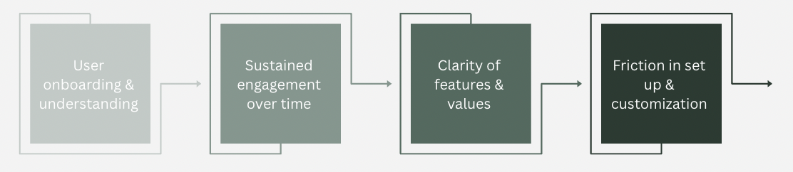
Therefore, it is important to understand:
How effectively Pinepomo supports users in starting, maintaining, and completing focus sessions?
Research Goal
To evaluate how users:
- understand and begin using the app
- interact with core features, such as the timer, settings, and stats features
- perceive value and motivation
- experience friction during setup and use
Research Questions
- How easily can users start a focus session?
- What usability issues exist in navigation?
- What prevents users from returning to the app?
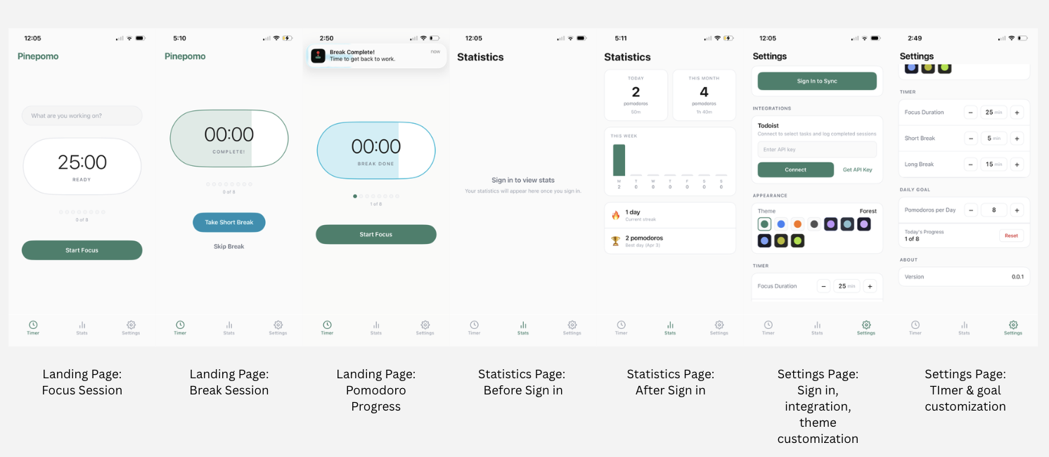
Product Layout
Methods
To evaluate the usability and overall user experience of Pinepomo, I conducted a mixed-methods approach combining a heuristic evaluation with an unmoderated usability study.
A heuristic evaluation was performed using Nielsen’s usability heuristics alongside multimedia and cognitive design principles. This analysis focused on identifying usability strengths and friction points across core areas of the app, including session initiation, navigation, settings, and progress tracking. This approach allowed for a structured assessment of how well the interface supports intuitive interaction, reduces cognitive load, and aligns with user expectations.
In addition, an unmoderated usability study was conducted using a TestFlight build of Pinepomo to observe real user interactions and behaviors in a natural setting.
- Sample Size: 12 participants between 20-35 years old who have utilized productivity and task management tools prior
- Recruitment: Personal Network of individuals familairwith productivity based workflows, however almost all were unfamilar with Pomodoro
Procedure
Participants were asked to complete a series of task-based activities including:
- Start a focus session
- Adjust timer settings
- Explore the stats page
- Attempt to connect task integration
- Complete one full or partial session
Participants recorded their screens and provided written feedback after each task, allowing for identification of usability issues, behavioral patterns, and points of friction throughout the experience.
Approach
By combining heuristic analysis with user-based observation, this method provided both expert evaluation and real user validation, enabling a deeper understanding of how design decisions impact usability, engagement, and task completion.
Key Findings
Heuristic Evaluations
The interface reflects several key multimedia and cognitive design principles, including coherence through a minimal, distraction-free layout, signaling through clear emphasis on primary actions such as the timer and “Start Focus” button, and spatial contiguity through the grouping of related settings and features. These design choices reduce cognitive load and support efficient task initiation.
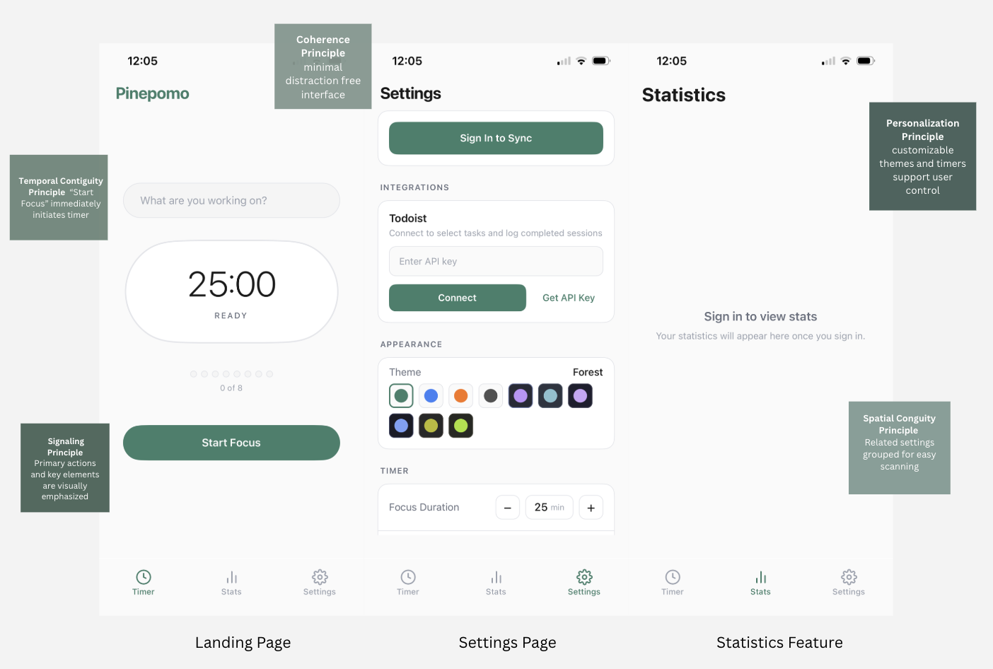
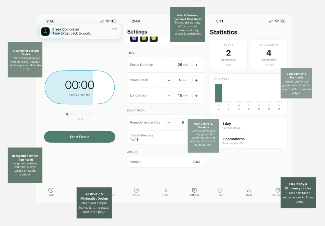
From a usability perspective, the interface aligns with several core UX heuristics that support intuitive interaction and user confidence. The system maintains clear visibility of status through real-time timer feedback and progress indicators, helping users understand where they are within a session at all times. Consistent navigation and interface patterns reduce the need for relearning across screens, allowing users to move seamlessly between features.
Additionally, the app supports user control through adjustable settings and goal customization, enabling individuals to tailor the experience to their workflow. Together, these elements create a predictable and responsive system, which lowers friction, increases efficiency, and allows users to focus on their tasks rather than the interface itself. However, there are opportunities to strengthen usability by improving onboarding and help documentation, particularly for first-time users who may not fully understand features like session goals or integrations. Furthermore, error prevention and feedback could be enhanced, especially in areas such as external integrations, where unclear setup requirements may introduce friction. Addressing these gaps would further reduce uncertainty and support a smoother, more guided user experience.
Usability Study Findings
1. Low friction to start, but limited context (High priority)
The “Start Focus” action is clear and immediately accessible, allowing users to begin a session with minimal effort. However, the lack of onboarding or guidance means users may not fully understand the workflow or long-term benefits of the app.
- Insight: Users can start quickly, but may lack the context needed to sustain engagement.
- Opportunity: Introduce a lightweight, step-by-step onboarding tutorial for first-time users.
“I like how easy it is to start, but I’m not really sure what happens after this.”
“It’s simple, but I don’t know what the goal is, like how many am I supposed to do.”
2. Limited Visibility of Value in Stats Feature (High Priority)
The stats feature is gated behind sign-in, and once accessed, only displays data for fully completed Pomodoro cycles. Users are unable to view progress from partial sessions.
- Insight: Users are asked to commit through sign in before clearly seeing the value of tracking.
- Opportunity: Allow preview of stats or partial progress to reinforce value early.
“I don’t want to sign in unless I know what I’m getting.”
“I expected to see something first, but it’s just blank unless I log in.”
3. External Integration Friction (Medium Priority)
The app includes task integration capabilities, but currently relies on a single platform and requires manual setup.
- Insight: Integration is valuable, but limited platform support reduces relevance for many users.
- Opportunity: Expand integrations to commonly used platforms and simplify connection flows.
“I don’t know what an API key is, so I’d probably skip this.”
“This feels like something I’d only do if I really needed it.”
4. Weak Feedback Loop for Motivation (Medium Priority)
Progress is displayed as “0 of 8,” but lacks reinforcement or encouragement throughout the process. If user swipes off platform, progress is erased on tracker.
- Insight: The app tracks progress but does not actively motivate users to continue, only a single notification is provided 30 seconds before ending timer.
- Opportunity: Introduce positive reinforcement, progress feedback, or milestone-based encouragement.
“It says 0 of 8, but it doesn’t really push me to keep going.”
“I feel like it’s tracking, but not encouraging me.”
5. Notification Visibility Limitations (Medium Priority)
While users receive notifications when a session ends, this vibration feature may be missed.
- Insight: Important transitions, like a focus session to a break session, can go unnoticed.
- Opportunity: Enhance notification feedback through sound cues, lights, or persistent alerts.
“If my phone is on silent, I’d probably miss when it ends.”
“I wouldn’t always be looking at my phone, so I might not notice.”
6. Break Timer Disruption During Phone Use (High Priority)
The break timer pauses when users exit out of platform to use their phones, even though phones are often used as a communication and entertainment tool during breaks.
- Insight: The app does not align with natural user behavior during breaks.
- Opportunity: Ensure break timers continue running regardless of device interaction.
“I usually scroll on social media during breaks, so I wouldn’t want the timer to stop.”
“It should keep going no matter what I’m doing.”
7. Premature Completion Messaging (Medium Priority)
The app displays “Great job, time for a break” before the session has fully ended, which can create confusion.
- Insight: Timing of feedback affects user clarity and trust.
- Opportunity: Replace with more accurate messaging (e.g., “Final 30 seconds” or “Almost there”).
“It says I’m done before I’m actually done, that’s kind of confusing.”
“I thought the session ended already, but it hadn’t.”
8. Inconsistent Progress Feedback (Low Priority)
While progress is tracked numerically through Pomodoros, there is limited feedback during sessions to reinforce momentum.
- Insight: Users benefit from continuous feedback, not just end-state results.
- Opportunity: Introduce real-time progress indicators or incremental feedback.
“It would be nice to see progress while I’m working, not just at the end.”
“I don’t really feel the progress as I go.”
Impact
Based on these findings, several key UX implications emerged to improve both usability and engagement. Introducing lightweight onboarding or contextual hints can help users better understand the app’s workflow from the start, while allowing a preview of stats before requiring sign-in can communicate value earlier and reduce friction. Additionally, strengthening motivation through clearer progress feedback and reinforcement can support habit formation over time. Together, these improvements are expected to increase session start rates, improve completion of focus sessions, and drive higher long-term retention.
Reflection
This project reinforced how critical early user experience is in shaping long-term engagement, especially in habit-forming products. While Pinepomo succeeds in reducing friction at the point of entry, the study highlighted that ease of starting is only one part of the experience, users also need clear value, guidance, and reinforcement to continue. I learned that small moments, such as how progress is communicated or when feedback is delivered, can significantly impact motivation and consistency. Additionally, this project emphasized the importance of aligning product behavior with real-world user habits, particularly in contexts like breaks where users naturally turn to their phones. Overall, this experience strengthened my ability to evaluate not just usability, but how design decisions influence behavior, engagement, and long-term product success.